Swinton Dental Centre Branding
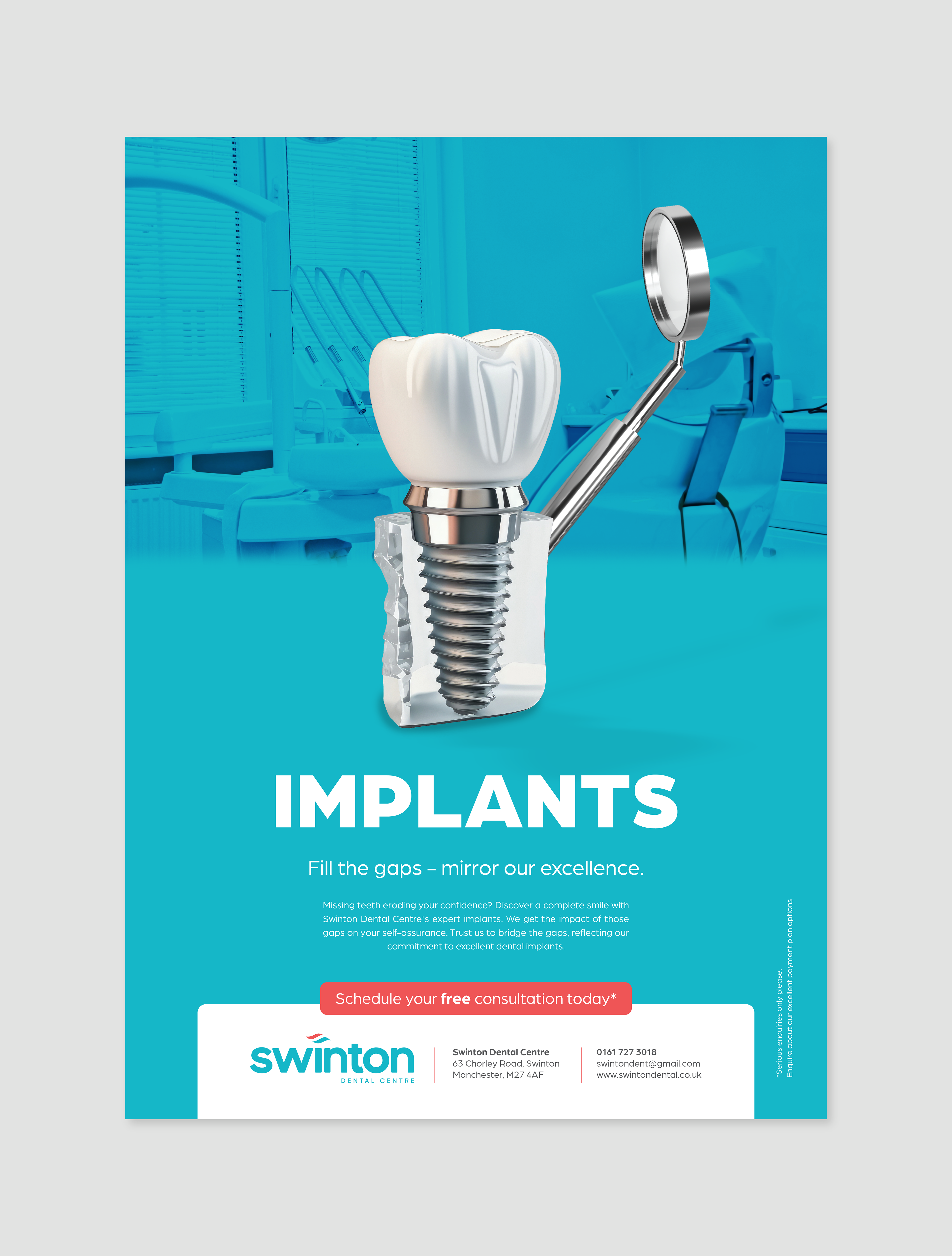
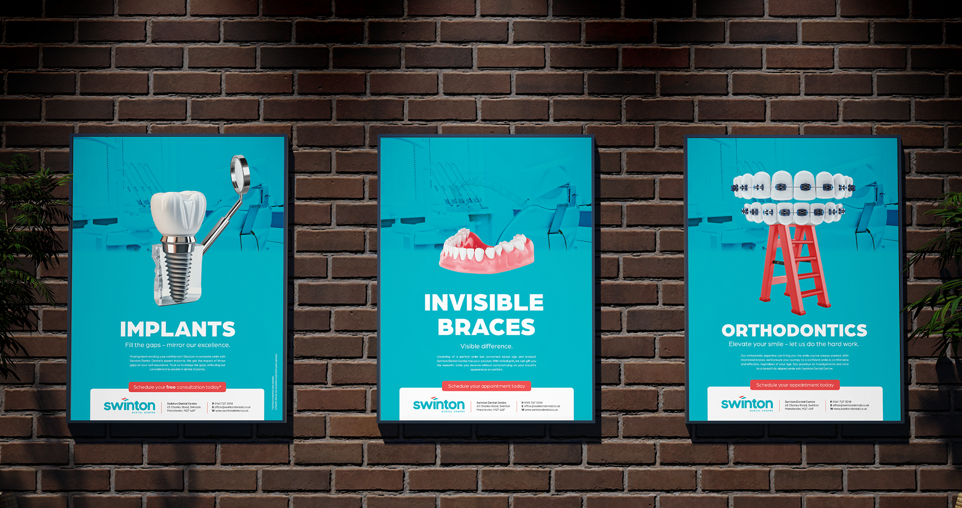
The challenge: To build a brand identity for Swinton Dental Centre. At Swinton Dental Centre, they proudly uphold a tradition of family-oriented care as many of their valued clients have been with them for two to three generations. Swinton Dental Centre were targeting a younger clientele with this branding. The goal of the branding was to portray a modern image, appear family-friendly advertise the services they offer and ultimately grow their business.
Programs used: Adobe Illustrator, Adobe Indesign, Adobe Photoshop, Adobe Firefly
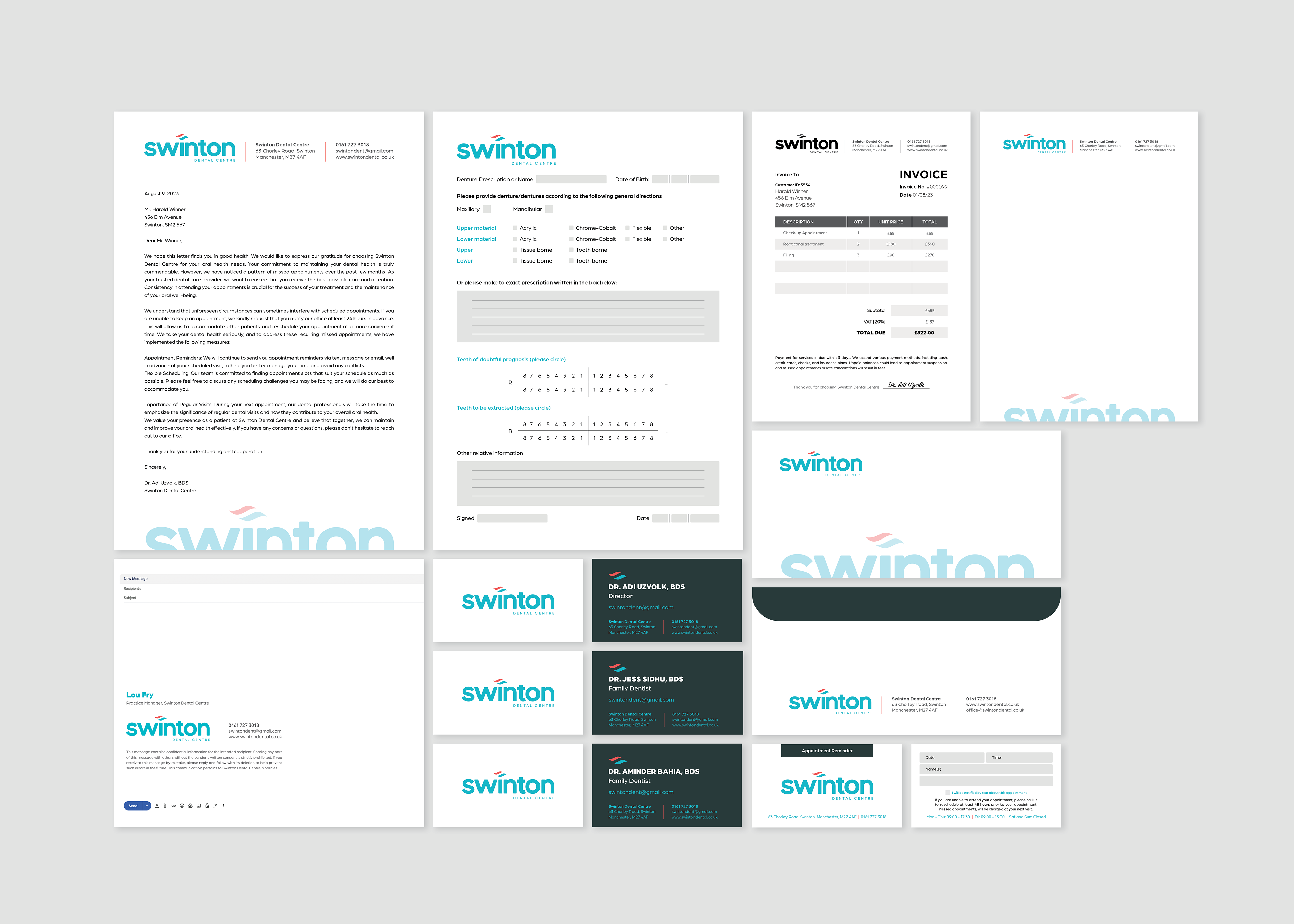
The Swinton Dental Centre logo encapsulates a compassionate and approachable brand essence within the sterile dental landscape. The rounded corners of the word Swinton mirror the warm and caring staff, inviting families to an approachable, friendly atmosphere. The lower-case letters impart a modern and down-to-earth vibe, aligning with the compassionate touch. The fluid swoosh embodies urgency and contemporary care, and also signifies dynamism and innovation - emphasised with the sharp edges that the swoosh ends in.
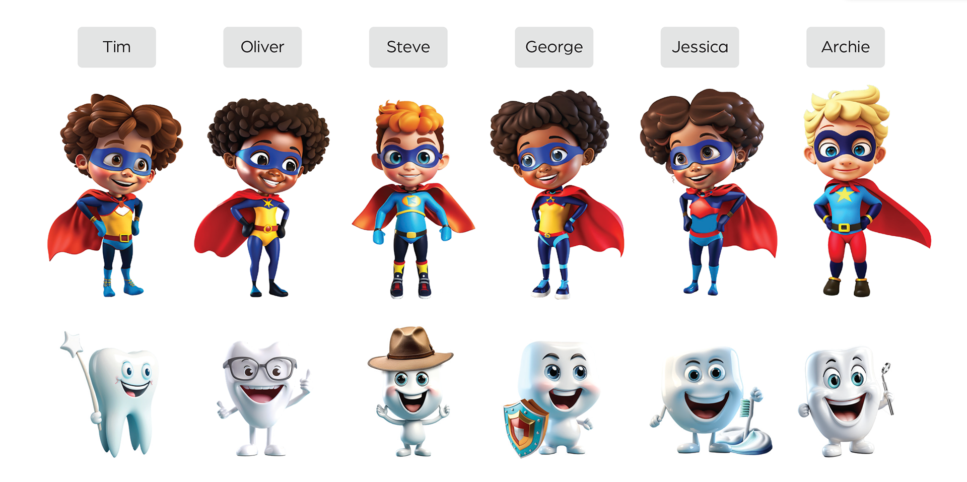
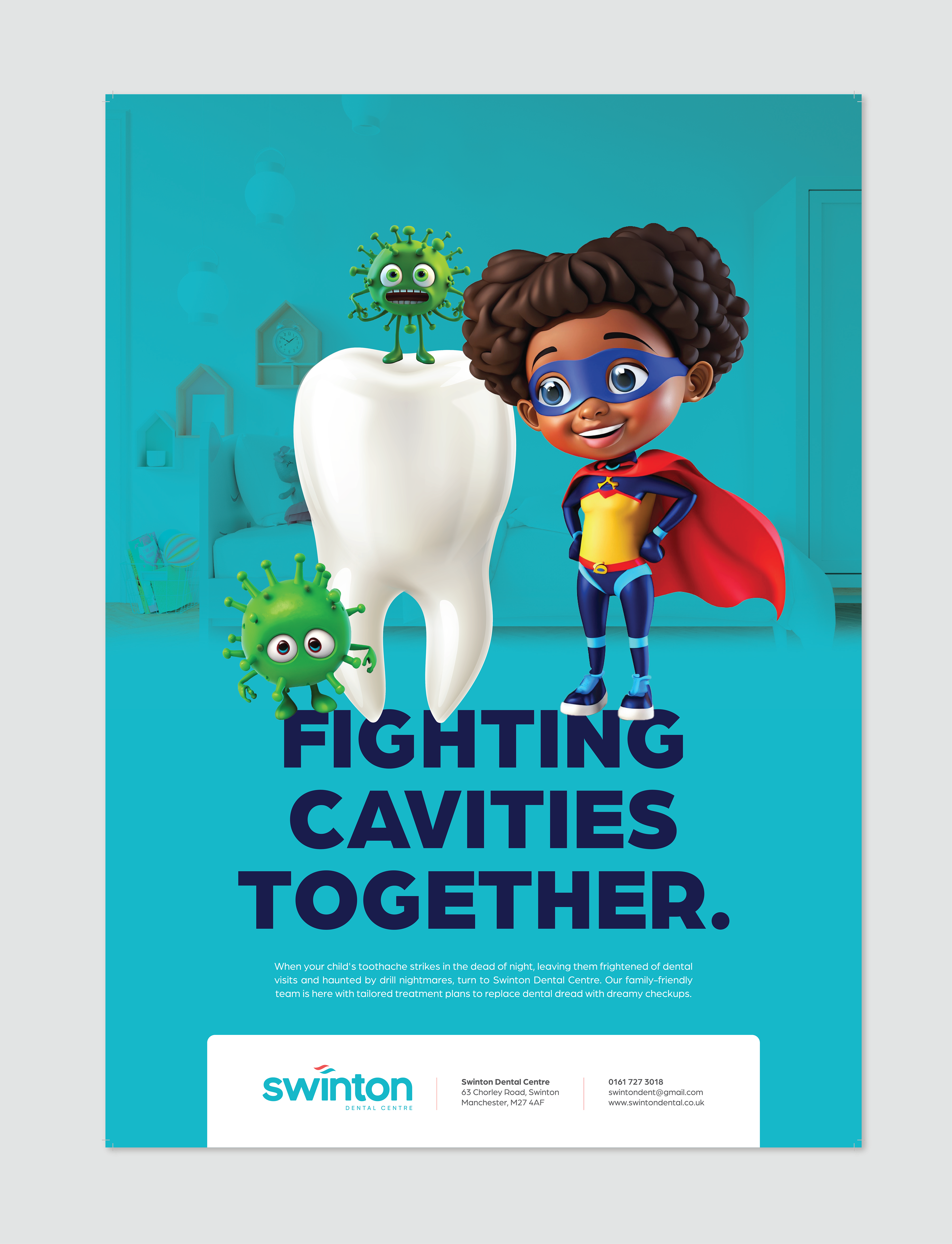
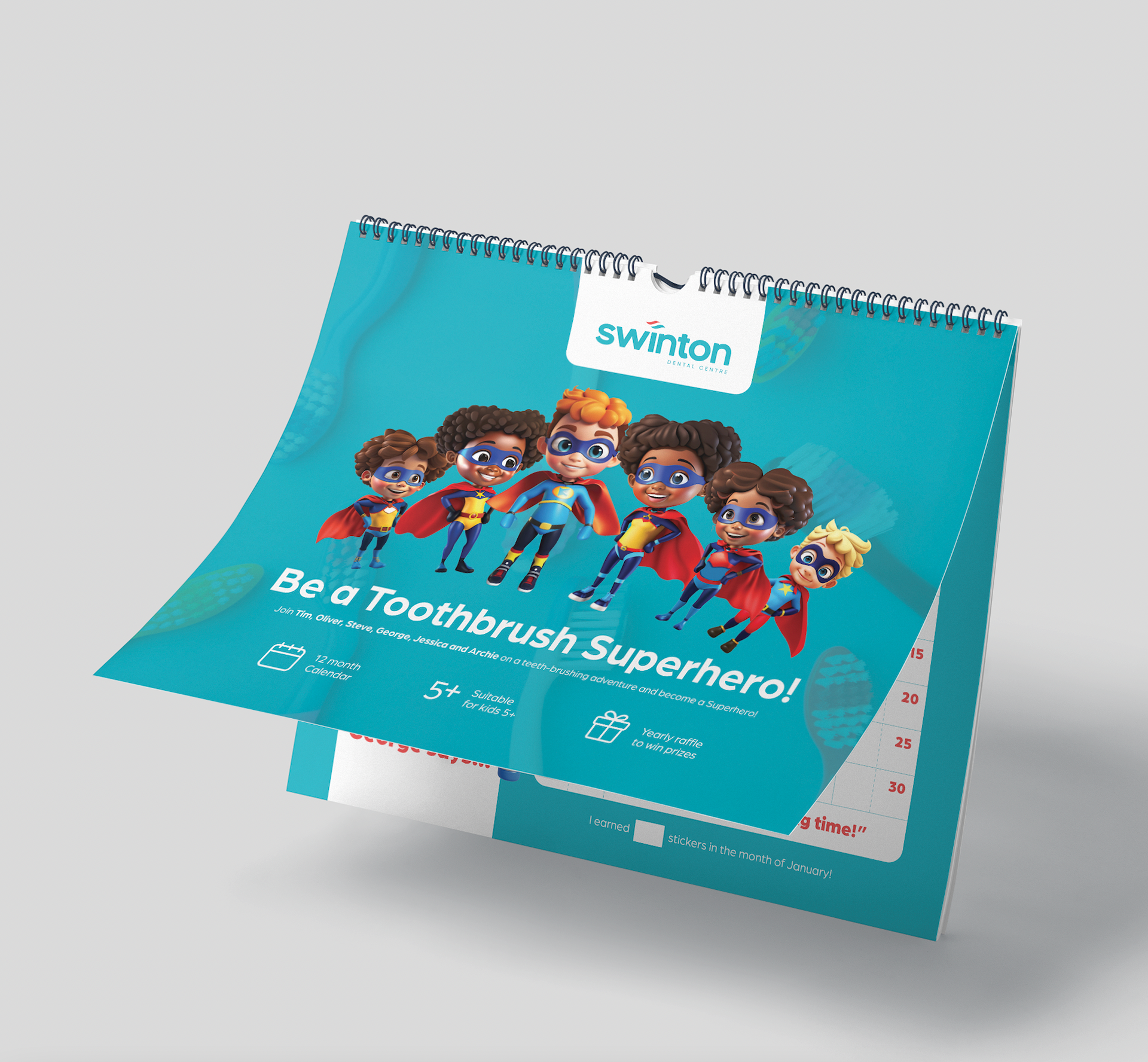
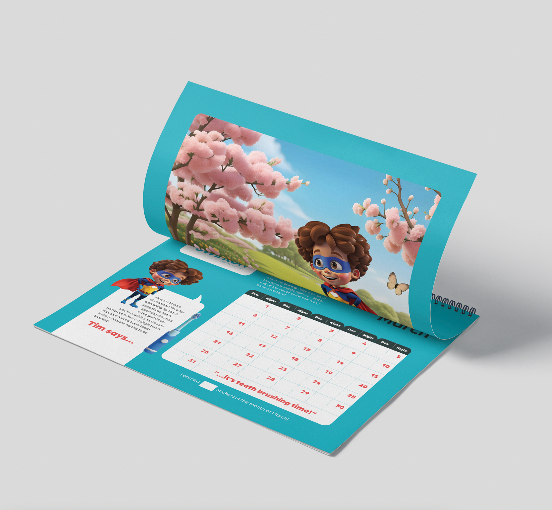
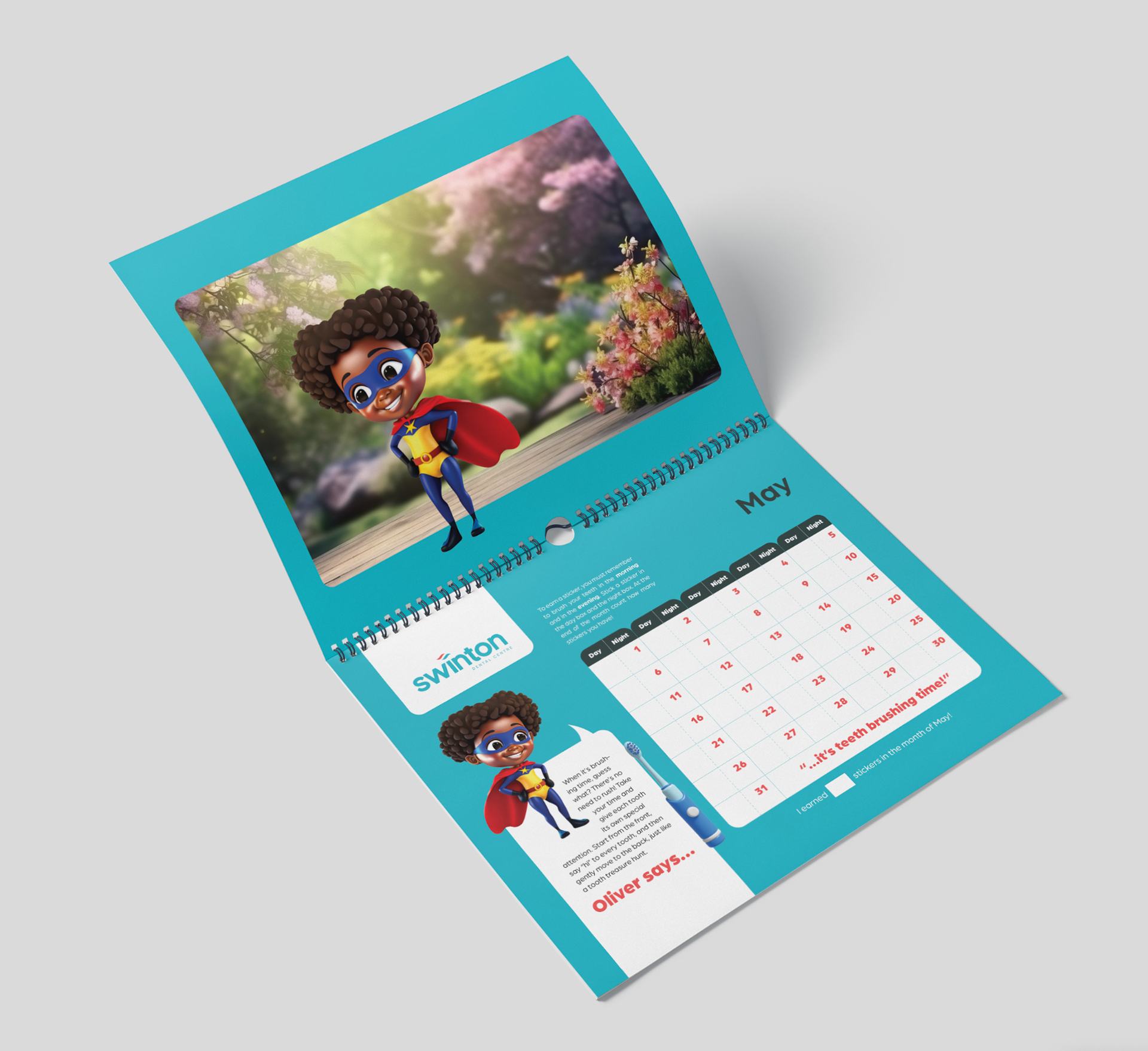
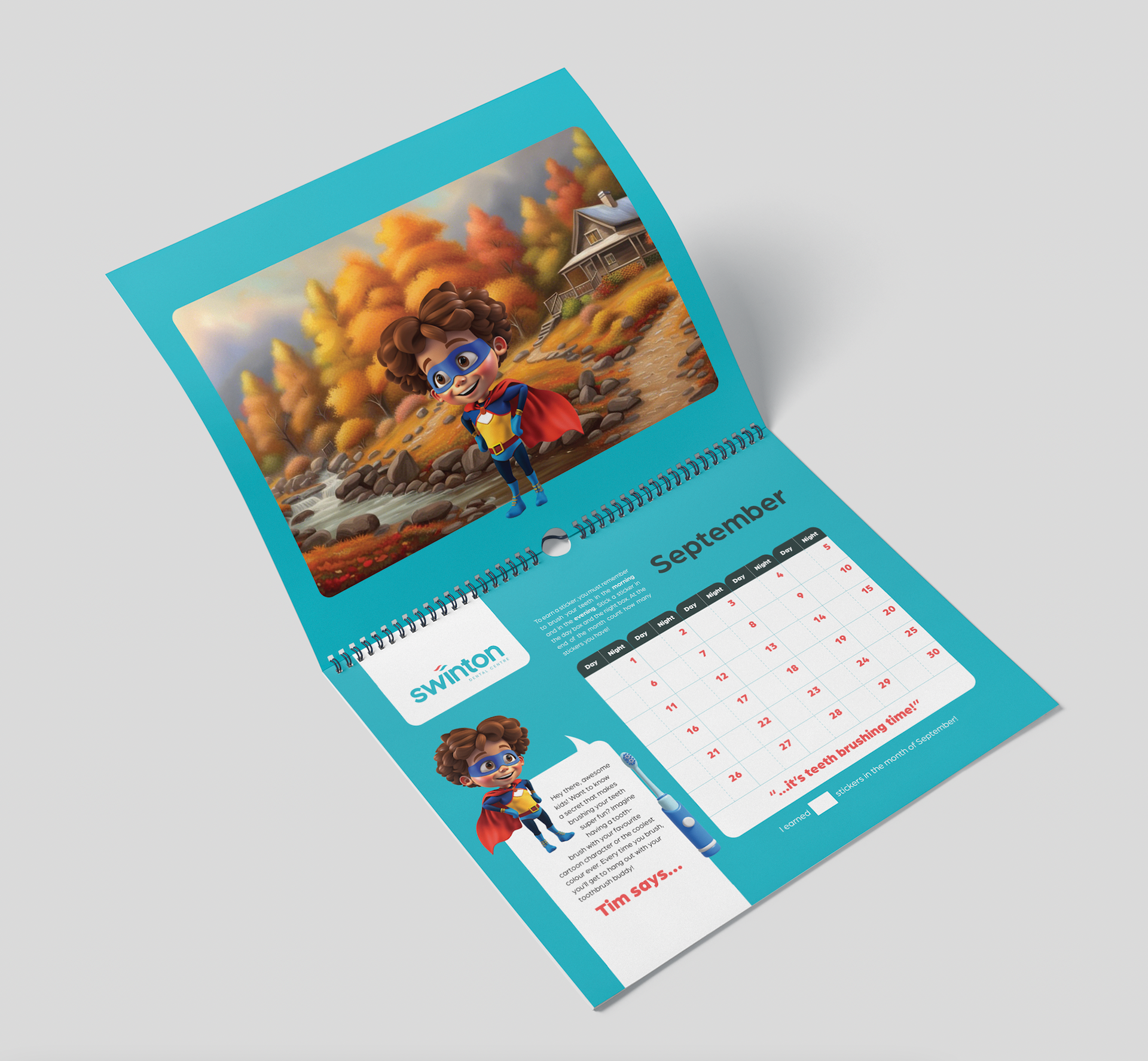
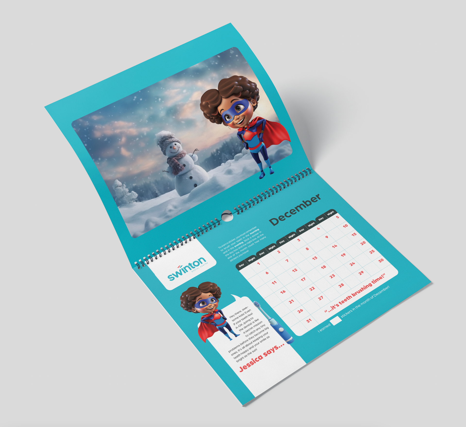
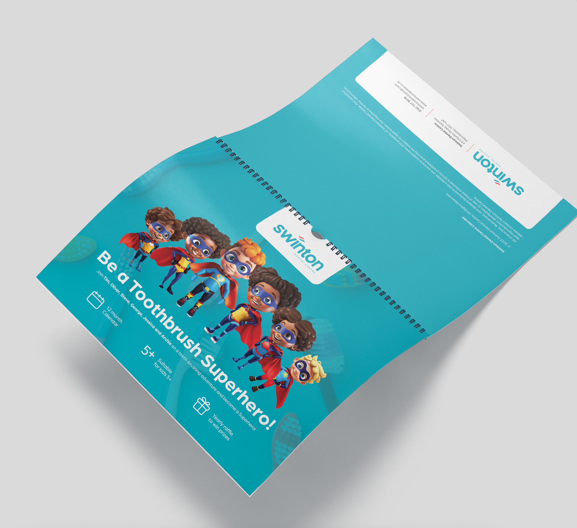
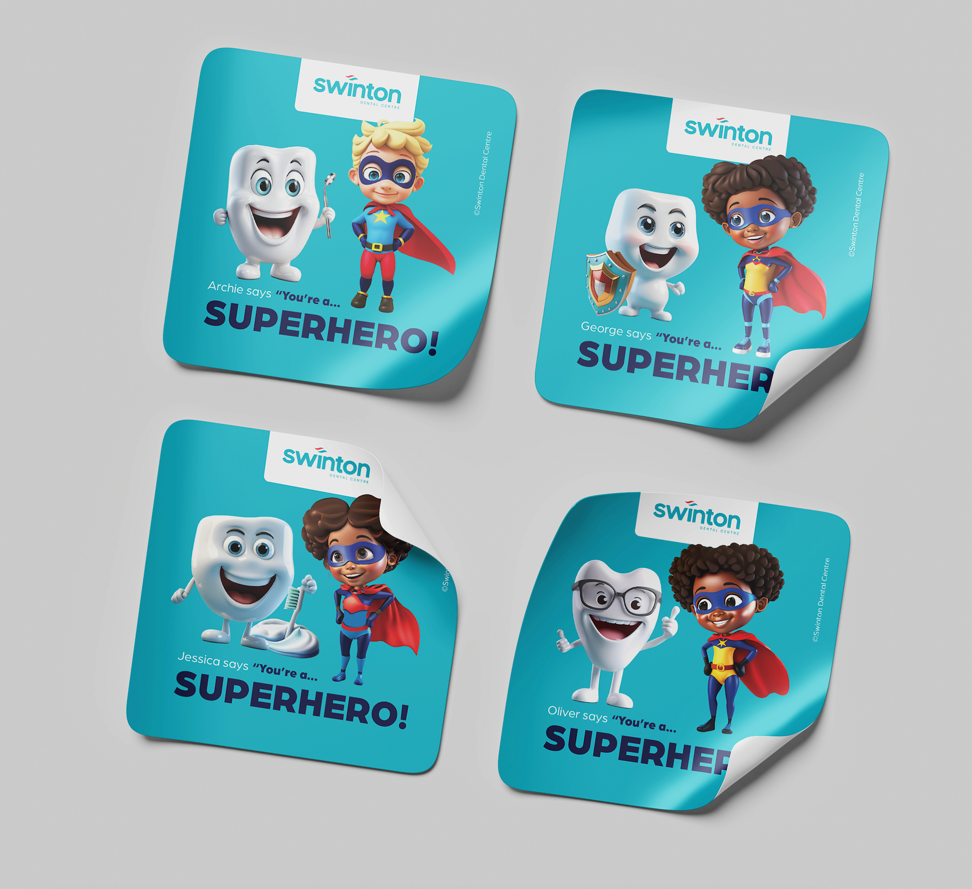
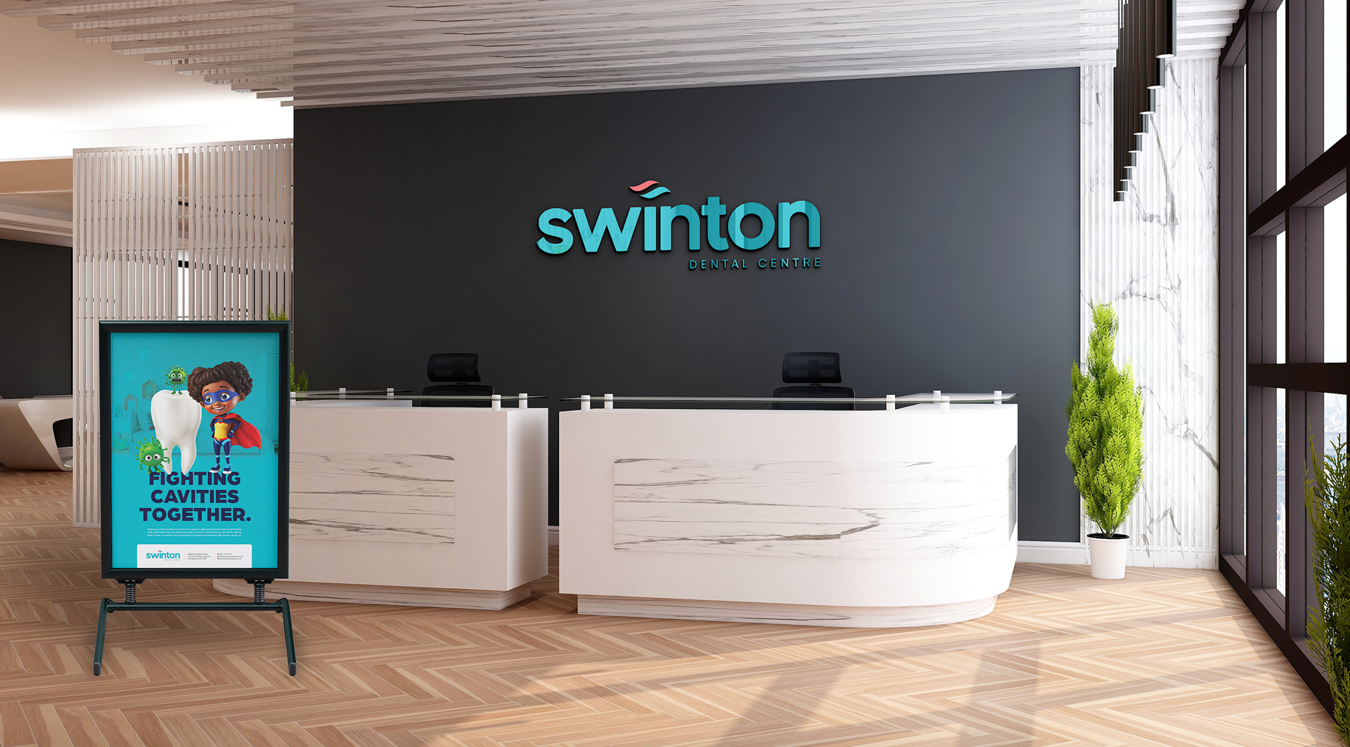
Above are a set of superheroes that I created using Adobe Firefly. I used this set of six superheroes across a tooth brushing campaign and the posters featured at the dentist. The toothbrushing campaign consisted of a calendar geared towards young children, encouraging them to brush their teeth twice daily, with the chance to win a prize once they submitted their challenge.